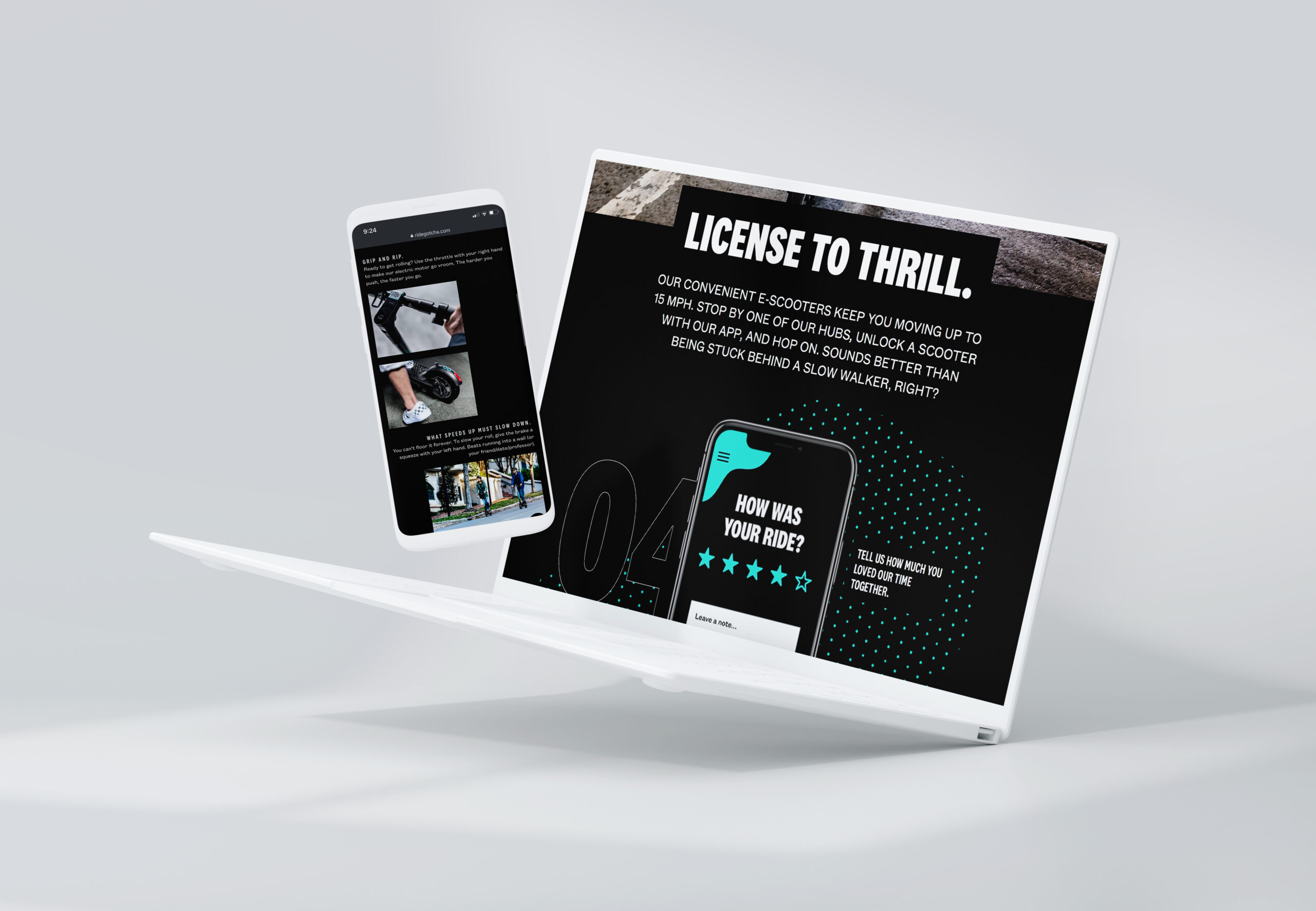
Rebrand, photography, and custom site for the micro-mobility startup, Gotcha.
↓↓↓
Rebrand, photography, and custom site for the micro-mobility startup, Gotcha.
↓↓↓
Rebrand, photography, and custom site for the micro-mobility startup, Gotcha.
↓↓↓
Rebrand, photography, and custom site for the micro-mobility startup, Gotcha.
↓↓↓
Rebrand, photography, and custom site for the micro-mobility startup, Gotcha.
↓↓↓


The Brief
Gotcha had been operating and growing slowly for almost 8 years as a white-label service. They had very little brand recognition outside of current partners and needed to create a brand and site that could communicate to their target audience, partners, and potential investors. With an everchanging market and lineup of services and products the updated site needed to have a modular design that could easily accommodate new sections and pages. In order to keep onboarding simple and achieve a modular page structure, we choose to build the site using a WordPress CMS. With a fresh modern look and feel and a website as seamless as their fool-proof new business strategy Gotcha was ready for unprecedented growth - ultimately leading to an acquisition less than two years later.

Visual Brand Language
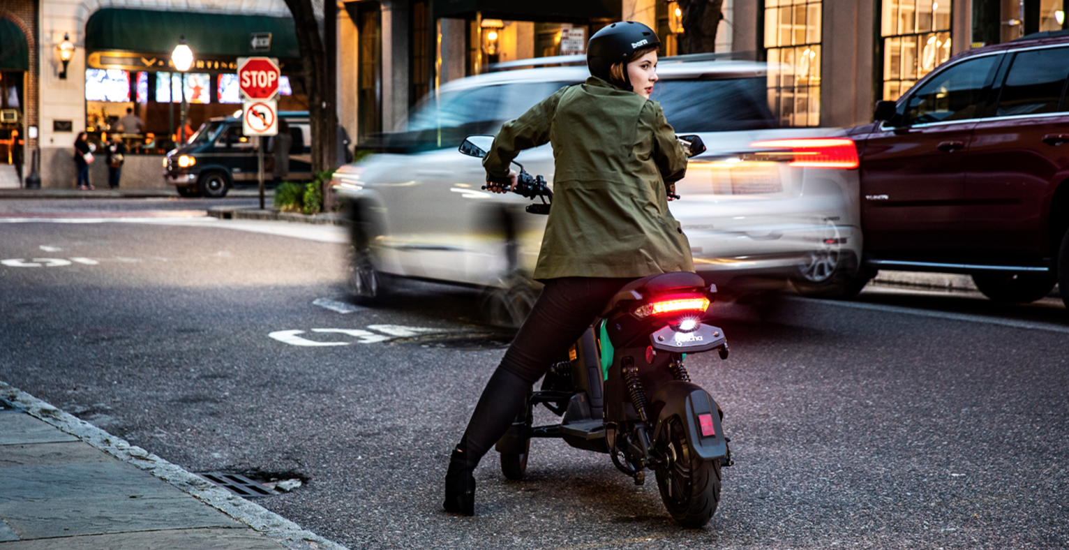
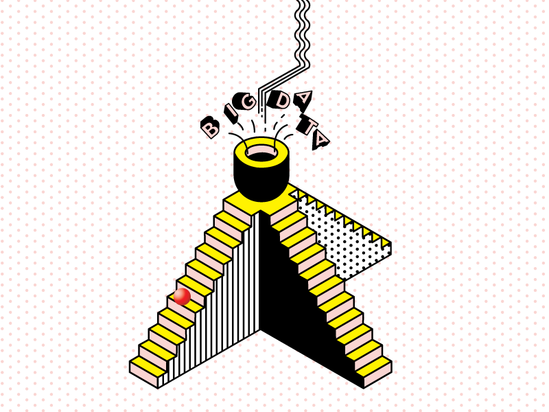
While designing the website Ui I started to develop a visual brand language that could roll out across numerous touchpoints and communication pieces. A key piece of the brand language is motion and implied motion. To help bring that in, a system of patterns, shapes, lines, dot textures, and expressive typography treatments were created. Our playful and expressive design system paired with the high contrast, lifestyle photography gave Gotcha the attitude and confidence to attract both new riders, partners, and investors.
.


Visit the site
Visit the site
Visit The Site:
Visit The Site:
Visit The Site:
Client: Gotcha
Creative Director: Paul Dunbar
Copywriter: Adam Hansen
Designers: Paul Dunbar, Abby Pickus, Jake Lutz
Photography (bikes, scooters, ride): April Greer
Photography (trikes): Kirk Roberts
Social Media: Michael Stettner
Marketing and Strategy: Anne Morgan, Adam Hansen
Press + Media: Caroline Passe
More Projects

Alto EssentialsName, Brand Strategy, Brand Identity, Packaging, Illustration

Wynwood BrewingIllustration, Packaging, Concepting

Lass & LadName, Brand Strategy, Brand Identity

HotboxNaming, Strategy, Brand Identity, Packaging, Environmental Graphics, Menu

Furgo!Naming, Strategy, Brand Identity, UX, UI, Product, App

Ride GotchaBranding, Strategy, UX, UI, Product, App

Indigo GardensPositioning, Campaign Ideation, Cultre Strategy, Brand Elements

Harper MacawBrand Identity, Packaging

Squash On FireBrand Identity

Capitol Cider HouseBrand Identity, Packaging, Environmental Graphics, Signage, Menu, Website

Adfest 2016Event Branding
If you steal any of this work your fingers will fall off.
If you steal any of this work your fingers will fall off.
If you steal any of this work your fingers will fall off.