Creating an all in one rideshare, bike, and scooter app for micro-mobility startup Gotcha.
Creating an all in one rideshare, bike, and scooter app for micro-mobility startup Gotcha.
Creating an all in one rideshare, bike, and scooter app for micro-mobility startup Gotcha.
Creating an all in one rideshare, bike, and scooter app for micro-mobility startup Gotcha.
Creating an all in one rideshare, bike, and scooter app for micro-mobility startup Gotcha.
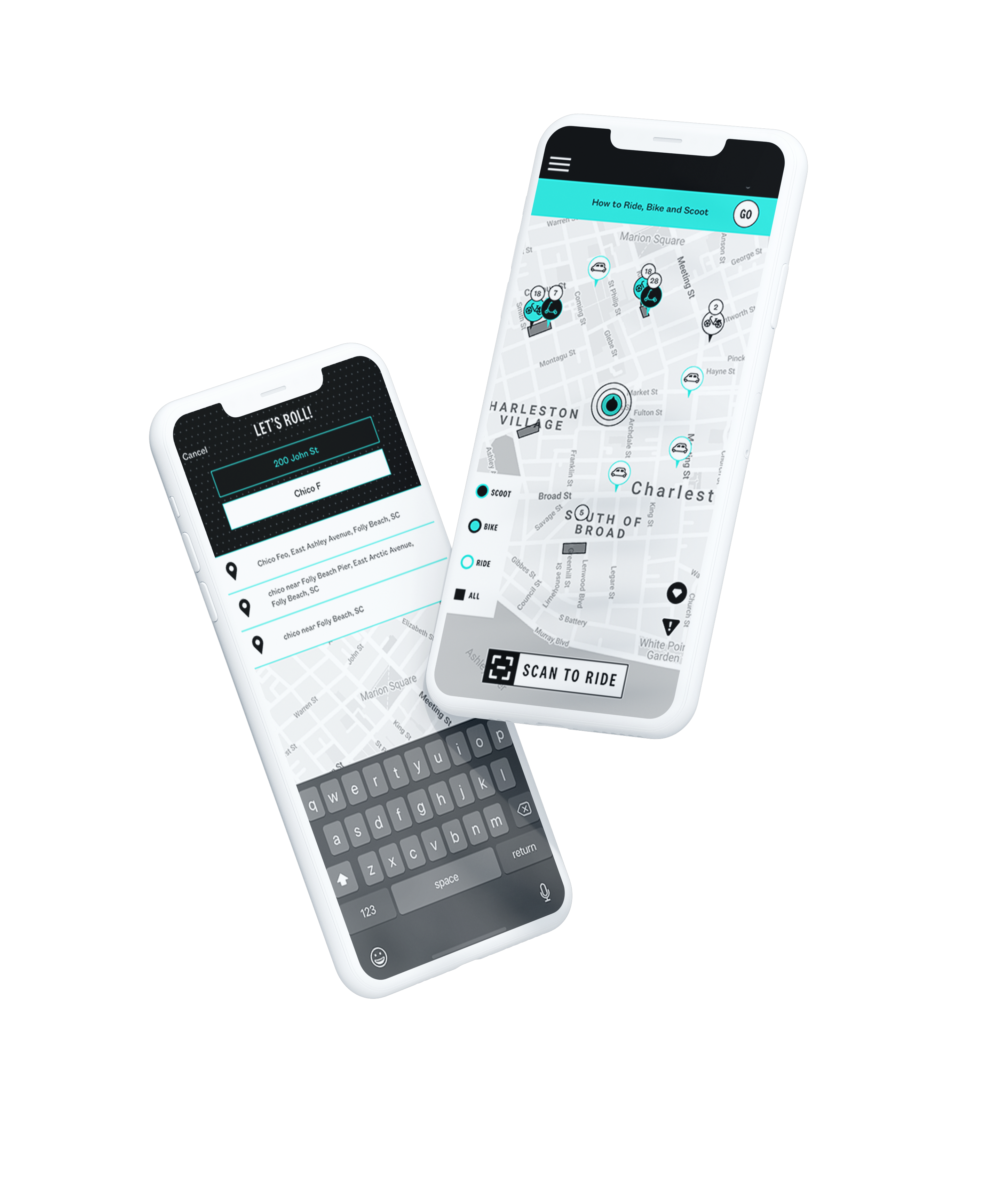
The Brief
Gotcha was starting from scratch with a small budget and less than 6 months to launch their first iteration. All of the new in-market products like their bike, scooter, and trike were still conceptual and in development at the start of this project.
The Brief
Gotcha was starting from scratch with a small budget and less than 6 months to launch their first iteration. All of the new in-market products like their bike, scooter, and trike were still conceptual and in development at the start of this project.
The Brief
Gotcha was starting from scratch with a small budget and less than 6 months to launch their first iteration. All of the new in-market products like their bike, scooter, and trike were still conceptual and in development at the start of this project.

The Solution
Even with our small budget and tight timeline, we were able to get some preliminary user interviews, persona development, and journey mapping sorted out. With the executive team and department heads aligned we established our MVPs and got to work. Lucky for us, people were already used to a few design patterns from interacting with Bird, Lime, and others in the space. Our goal was to work off of already established patterns, create a design system that could be easily replicated as we added new features. We knew our in-market products and app would have a fair amount of issues when we launched. The goal was to capitalize on The Aesthetic-Usability Effect and the amazing customer support team to help us gather real-time insight and give our team the data we needed to improve and iterate over the following year.
Ideation
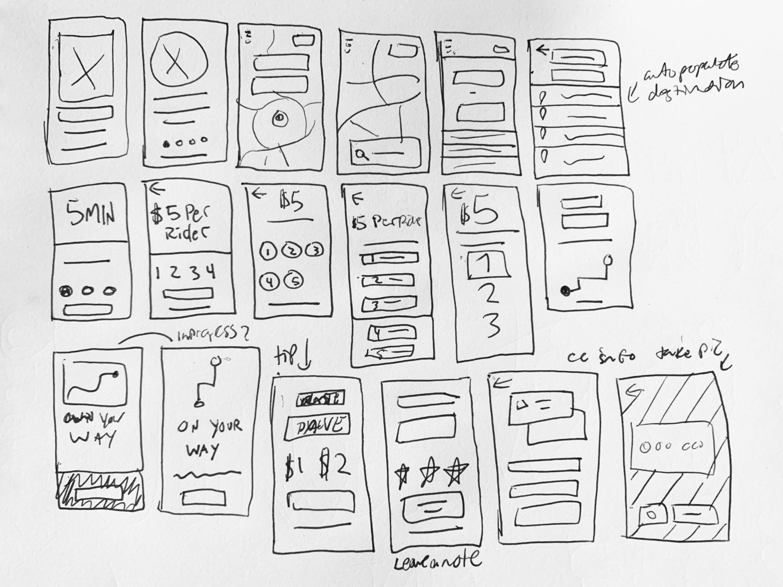
I needed to generate a high volume of concepts for different features and layouts in a relatively short amount of time. There are a ton of ways to approach this, I really enjoy methods like "crazy 8s" and "bad ideas only".
Sketching also helps communicate new ideas to developers early on and has the added benefit of letting non-design team members contribute their ideas. You never know where a great idea can come from!
Ideation
I needed to generate a high volume of concepts for different features and layouts in a relatively short amount of time. There are a ton of ways to approach this, I really enjoy methods like "crazy 8s" and "bad ideas only".
Sketching also helps communicate new ideas to developers early on because they won't feel like you've made all of the key decisions without them. Plus if you can I often try to include other people and stakeholders who aren't designers in this process. You never know where a great idea can come from!
Design Sprints
We had a very short timeline to get this app launched in ios and an even smaller budget. Our sole full-stack dev, Reece Long, and I were able to plan our MVP relatively quickly. Our biggest issue was the Business Development team making promises to future markets that we weren't aware of. Since our timeline and budget were very small our product manager, Leah helped setup 5-day sprints. We were able to jump into wireframes and low fidelity prototypes to make, test iterate, and repeat quickly. Our office was small and we were able to get in front of stakeholders and gather feedback regularly. Our product was live in 4 markets in less than 6 months.
Design Sprints
We had a very short timeline to get this app launched in ios and an even smaller budget. Our sole full-stack dev, Reece Long (guy is a legend), and I were able to plan MVP relatively quickly. Our biggest issue was the Business Development team making promises to future markets that we weren't aware of. Since our timeline and budget were very small our product manager, Leah helped setup 5-day sprints. We were able to jump into wireframes and low fidelity prototypes to make, test iterate repeat quickly. Thanks to being a startup, our office was small and we were able to get in front of stakeholders to share progress and gather feedback regularly. Our product was live in the apple stores and in 4 markets in less than 6 months.
Design Sprints
We had a very short timeline to get this app launched in ios and an even smaller budget. Our sole full-stack dev, Reece Long (the guy is a legend), and I were able to plan MVP relatively quickly. Our biggest issue was the Business Development team making promises to future markets that we weren't aware of. Since our timeline and budget were very small our product manager, Leah helped setup 5-day sprints. We were able to jump into wireframes and low fidelity prototypes to make, test iterate repeat quickly. Thanks to being a startup, our office was small and we were able to get in front of stakeholders to share progress and gather feedback regularly. Our product was live in the apple stores and in 4 markets in less than 6 months.
Design Sprints
We had a very short timeline to get this app launched in ios and an even smaller budget. Our sole full-stack dev, Reece Long, and I were able to plan our MVP relatively quickly. Our biggest issue was the Business Development team making promises to future markets that we weren't aware of. Since our timeline and budget were very small our product manager, Leah helped setup 5-day sprints. We were able to jump into wireframes and low fidelity prototypes to make, test iterate, and repeat quickly. Our office was small and we were able to get in front of stakeholders and gather feedback regularly. Our product was live in 4 markets in less than 6 months.
Design Sprints
We had a very short timeline to get this app launched in ios and an even smaller budget. Our sole full-stack dev, Reece Long, and I were able to plan our MVP relatively quickly. Our biggest issue was the Business Development team making promises to future markets that we weren't aware of. Since our timeline and budget were very small our product manager, Leah helped setup 5-day sprints. We were able to jump into wireframes and low fidelity prototypes to make, test iterate, and repeat quickly. Our office was small and we were able to get in front of stakeholders and gather feedback regularly. Our product was live in 4 markets in less than 6 months.

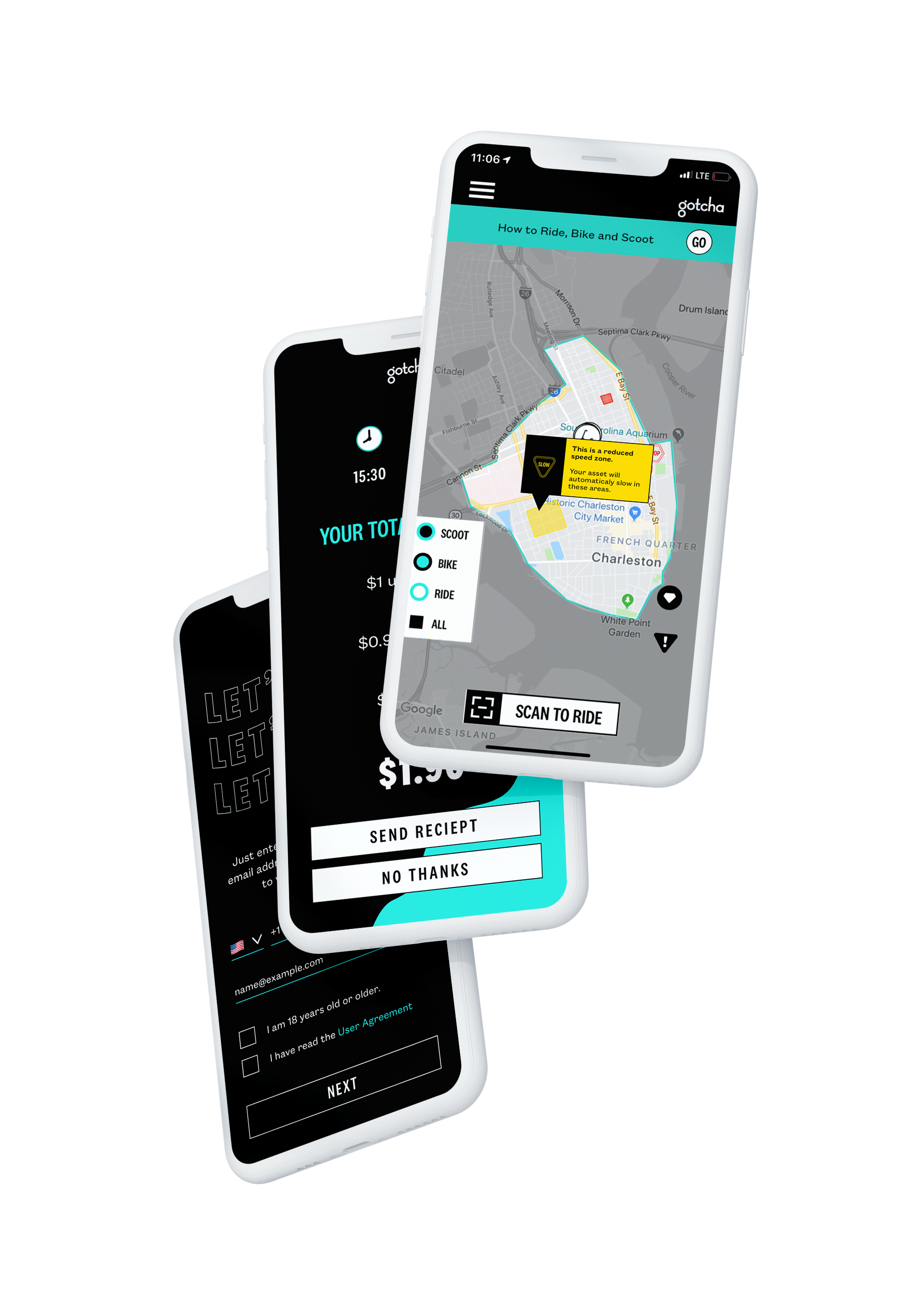
High Fidelity Prototype
During the website design and earlier re-brand, I began to develop a design system that could span across all digital pieces from the product, site, and internal and external communication pieces.
We used Sketch and Invision to create and user test high fidelity prototypes within our organization.
Tools used: Sketch, Illustrator, Photoshop, Invision, and Zeplin.
Check out some press below for more details. Or visit the app store for the latest incarnation.
Check out some press below for more details. Or visit the app store for the latest incarnation.
Check out some press below for more details. Or visit the app store for the latest incarnation.
Check out some press below for more details. Or visit the app store for the latest incarnation.
Checkout some press below and the Ride page on Gotcha's site for more details on.
More Projects

Alto EssentialsName, Brand Strategy, Brand Identity, Packaging, Illustration
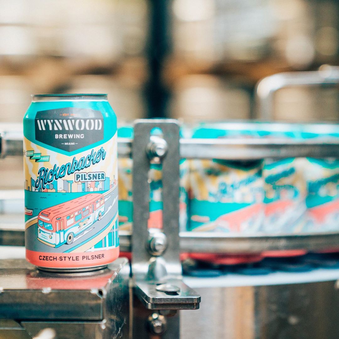
Wynwood BrewingIllustration, Packaging, Concepting

Lass & LadName, Brand Strategy, Brand Identity

HotboxNaming, Strategy, Brand Identity, Packaging, Environmental Graphics, Menu

Furgo!Naming, Strategy, Brand Identity, UX, UI, Product, App

GotchaBranding, Strategy, UX, UI, Art Direction, Web Design, Creative Direction

Indigo GardensPositioning, Campaign Ideation, Cultre Strategy, Brand Elements

Harper MacawBrand Identity, Packaging

Squash On FireBrand Identity

Capitol Cider HouseBrand Identity, Packaging, Environmental Graphics, Signage, Menu, Website
Adfest 2016Event Branding
If you steal any of this work your fingers will fall off.
If you steal any of this work your fingers will fall off.
If you steal any of this work your fingers will fall off.